My name is Takeo Fujii (Takeo Fujii). In this entry, I'll share 7 tips to increase your website's conversion rate.
It will take your time. Therefore, I will list the benefits of reading this article in advance.
- If the closing rate increases, the product will sell better -> sales will increase.
- Identify the right website to create in this age of information overload -> Become a highly profitable website
There are other benefits. There are too many to list. The main advantages are the above two.
In short, we will talk about how to take a website with low response rate, too low closing rate, and low profitability and turn it into a "profitable website".
What is the closing rate?

First, let me explain the closing rate. It is a percentage of how many orders you have received. In marketing, it is also known as the Conversion Rate.
Marketers are playing around and studying the page to improve this signup rate by 0.1%.
There is a question that is more important than the definition of words. It's about what you can do to quickly increase your website's conversion rate.
How can you close more product/service deals? I will explain specific ways to improve your website's closing rate by playing with super simple tricks.
Why you need to increase the closing rate on your website
You can find "how to increase the conversion rate" by Googling. However, you won't find a page that tells you exactly how to increase your website's conversion rate.
In most cases, there are only commonplace explanations. In most cases, the explanation is as simple as, "If you get thirsty, drink barley tea.
In this article, I'll explain exactly what I'm doing. Tips on how to increase your closing rateI will explain seven These are tips that are super easy to use when creating a website.
You can install it in three seconds after reading this article. Try it out; I'll start with the first one.
1) The first move has an impact.
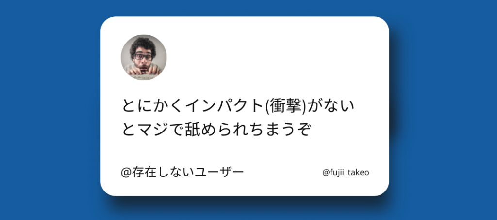
If I had to describe the modern age, I would say "information overload.
Every 20 minutes on Facebook, a million links are shared and 3 million messages are sent. 6,000 tweets are sent per second.
On YouTube, there are 500 hours of video uploaded per minute all over the world. To put it bluntly, it's information overload.
Your website is being licked.
In this day and age, your website is caught in a whirlpool of information.
That's why you can't get access. Your site is just a tiny thing. Unfortunately, it's just one piece of a huge amount of information. Yes, my site is the same.
Visitors who come to your website will forget that your website exists in an hour.
This is because there are 380 websites being created every minute.
According to the World Wide Web Size Project, the number of pages currently indexed by Google is at least 4.45 billion.
How to Increase Your Website Presence
If you want to attract attention to your website and sell your products in the vast amount of information on the Internet, you need to make an impact.
Your website needs to have enough impact to compel people to pay attention.
For example, here's one technique. Place power words with high impact in a prominent place in your website. That's one.
I am making a list of power words. I'll post some of them here.
- preposterous
- half-crazed
- fear
- gambling
- betting
- gullible
- hacking
- harmfulness
- made-up story
- well-being
- Eroica Symphony (Beethoven, 1804)
- hero
- honor
- hope
- I don't believe it.
- be shocking
- Amazing
- astounding
- conviction
- wonder
Put these words in a prominent place on your website. Draw attention to them. This is one way to do it. Below is a portion of a website I worked on.
I put the word "death" prominently in the top header of the site. It is a power word.
It will not make a good impression. But it does have an impact. It attracts attention.
There are other ways as well. There are other ways to do this, such as designing your site, or making sure your website is unique and personal. There are many ways to do this.
If you can make an impact anyway, you are more likely to close the deal from there. On the other hand, websites that don't make an impact in their first response will be ignored and licked.
2) Readability
The website is hard to read. You will be disengaged the moment you get that chase. Your signup rate will drop dramatically.
- Speed of display
- Easy to read text size and line spacing
- Clear emphasis (bold, red text)
- Support for going mobile
Please do your best to address the above first. The font size should be 17px on a PC. Our blog is just barely 17px.
Line spacing is also important. If the line spacing is too narrow, it will look like the one below.
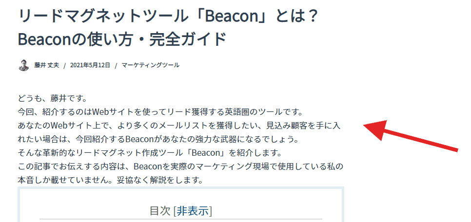
What do you think? I don't feel like reading. The line spacing is now 5px. Be aware of websites that make you read without stress.
3) CTA (Call To Action) is set up.
Set up a CTA. What do you want your website visitors to do? What action do you want them to take?
Do you want to sell a product or service? Do you want to lead to inquiries, or do you want people to fill out a survey?
CTA stands for Call To Action. It is a call to action to a person. One thing to be aware of in a website is to install one CTA per page.
Set up a clear CTA.
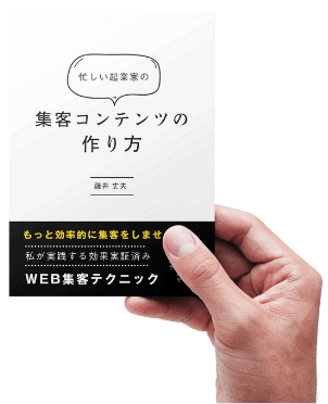
Examples from our website "Free Ebook
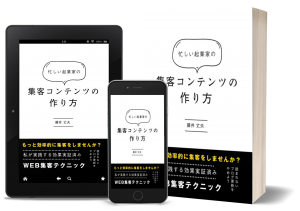
In my case, the top page of the website says, "We're giving away a free guidebook."
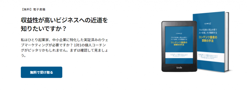
I want my visitors to download the guidebook I wrote. That's why I put a link to the download page of the guidebook on my website. This is my CTA.
I also have a CTA at the bottom of the article.
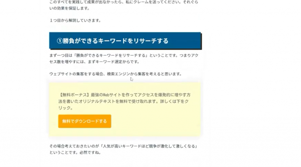
This CTA can be made a little more clickable. I will improve it again.
The tactic of making this ebook available for free download and acquiring potential customers was explained in the article below.
We are using a powerful prospect acquisition tool called Beacon. Please check it out.
Now you know what you need to do. Put a CTA on every page of your website, no matter what form it takes.
Points to be aware of in CTAs
I will talk about the points to be aware of in CTAs.
Buttons and links should be easy to click. Buttons that are large enough to be easily understood and easily clicked. Then put the link in a font size that is easy to tap on a smartphone.
Be aware of visitor-friendly CTAs. It will definitely increase your sign-up rate.
4) Reliability.
First, let's talk about the difference between trust and credibility.
Trust will be made later. Be kind to someone. If you do that, you will accumulate credit.
Trust is different. It is written "trust and rely on. Even if you've never met someone before, you can talk to them for an hour and build trust that they will do the right thing.
It's a trust that you (your product) will have a positive impact on me. Please create this trust on your website. Create it.
It is preferable to have both trust and credibility in business. However, in the early stages of business, there should be no trust.
If you don't have trust, it is important to make your website as trustworthy as possible. Create a website that generates trust.
I have written a separate article with more details on how to specifically create credibility on your website. It's worth reading.
Please see.
(5) Process the objection.
The rebuttal process is done on the website.
In sales, it's all about the turnaround. Your prospects will always have questions and concerns. Let me give you an example.
- The price of the product is high...
- There are other companies' products that are similar, but how are they different?
- You need to talk to your family about whether or not to buy it.
These are the objections you are bound to receive. If you cannot immediately respond to these objections, you will not be able to sell your products.
You won't be able to close a single deal on a product.
Anticipate the rebuttal process.
To increase your website's sign-up rate, anticipate the objections your prospects will have ahead of time.
One way to do this is to prepare "turn-around answers" to those objections in advance. One way to do this is to create a page of frequently asked questions.
Make sure that every question or objection that a potential customer has can be resolved immediately on your website. One way to do this is to create a knowledge base.
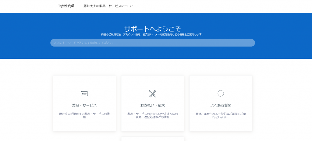
The above is the knowledge base I used to operate in the past. The above is the knowledge base that I used to operate in the past, but I don't use it now because the Japanese translation is not applicable.
Think of it as a one-step increase in your closing rate just by being able to process one counter-argument.
On the other hand, if you skip the refutation process, your closing rate will drop dramatically.
6) Test and improve key pages
Test the numbers on the main page in your website. Here is how.
- AB test
- Heat Map
- multivariate test
I am running all of them, but this site is A/B testing.ABtesting.aiThe following is an example of how to use
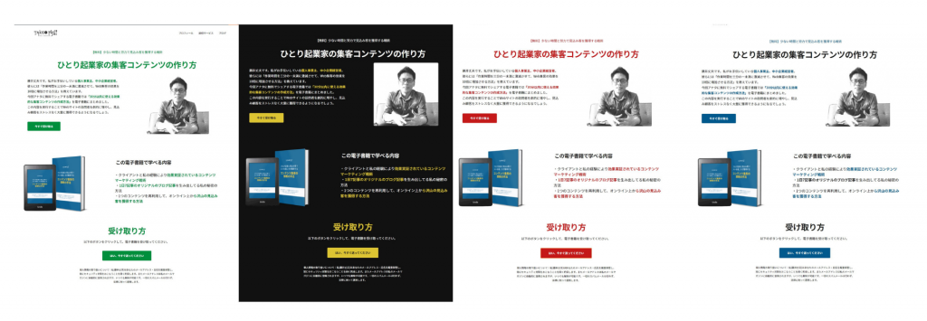
Right now, I'm testing 5 patterns each of button colors, images, and headings on this site.
In the image above, the button is either blue or green. We are testing to see which one is more likely to close the deal.
I use ABtesting.ai, which is easy to use, even for novice web marketers with no knowledge at all.A tool that allows you to implement A/B testing on WordPress (and it's super cheap).It is.

Since there was no article in Japan explaining this tool, I have written a detailed step-by-step guide on how to use it.
Definitely a game changer for A/B testing tools. Be sure to use it (it's my recommended tool).
How does the test work?
In extreme cases, non-marketers can use any method they want. You can use shortened URLs to see which pages are being clicked on and by how much. That kind of muddy method is OK.
Google Analytics alone is fine. Check the rough numbers. What pages are being read and how long do they stay?
Particularly important are the pages where you should get the numbers, such as the top page, opt-in page, and payment page. For example, the top page, opt-in page, payment page, etc.
These can be grasped with a fairly high degree of accuracy by linking ABtesting.ai with Google Analytics, so please make use of it.
(7) lowering the threshold
If you want to increase your conversion rate, lower your threshold. If you try to sell a product out of the blue, people won't buy it.
Let's say I sell a consulting package for 400,000 yen per month. Would you pay for it?
No, I won't pay it out of ten. First of all, it's too expensive to offer on the first try. In the first place, people have a hard time paying for things. They have a strong resistance to the act of taking out their credit card from their wallet to make a payment.
You can't sell expensive things on a website. Unless you have a lot of name recognition and support.
You should start with a simple offer. The "7-day free trial" and "product information request" are typical examples.
Increase your closing rate by clearing small hurdles first.
7 Tips for Increasing the Conversion Rate on Your Website [Summary].

Seven tips were explained. Summary.
- The first move has an impact.
- legibility
- CTA is in place.
- Reliability.
- Process the rebuttal.
- Take the numbers from the main pages and optimize them.
- lower the threshold
One way to do this is to write a blog within your website, which I didn't explain in this section because it would be too long.
Improve the closing rate by as little as 0.1%
Your conversion rate will vary depending on the format of your website.
Do you want a single page as a typical landing page, or what genre is the product/service you are selling?
What is certain is that the closing rate will change if you improve on the seven tips explained.
Large companies are scratching their heads over just changing the sign-up rate by 0.1%.
We are a small business. We are not like big companies. If we try to improve our closing rate, we can easily change a few percent.
We encourage you to work on improving your closing rate.




![How to redeem/activate a purchase at AppSumo [Illustration]. A man wearing glasses and a black shirt with a smile on a red and white background. The text reads "AppSumo How to redeem goods", highlighting a clue about "how to redeem goods at AppSumo".](https://takeofujii.net/wp-content/uploads/2024/06/appsumo-redeem-485x273.png)




Very nice article, just what I needed.
I'm glad you found it helpful.